Archive for the ‘ Design ’ Category

Paperwork

I love my job. I really do. I get to spend my days guiding people, and I think there is nothing more purely satisfying than being part of helping someone understand something that had before eluded them. And getting paid to get lost in math equations? Doesn’t get much better than that. It really is an awesome job, and every day I feel lucky to have it. There is, of course, one downside to this ideal job of mine: paperwork. Every two weeks I have to submit a few dozen forms detailing work completed with students for the particular period. This is not something I especially enjoy. Earlier this week I had the perfect opportunity to get a jump on the papers that would be due in by noon today. But, instead of trudging through the seemingly endless forms and check boxes, I grabbed a dull no.2 pencil from my bag and started scribbling in the corner of my math book. With paperwork on the brain it seemed only natural that that ended up being the subject of my doodling attempt.

The original the sketch as it was in my battered and beaten notebook:

Original Sketch 1

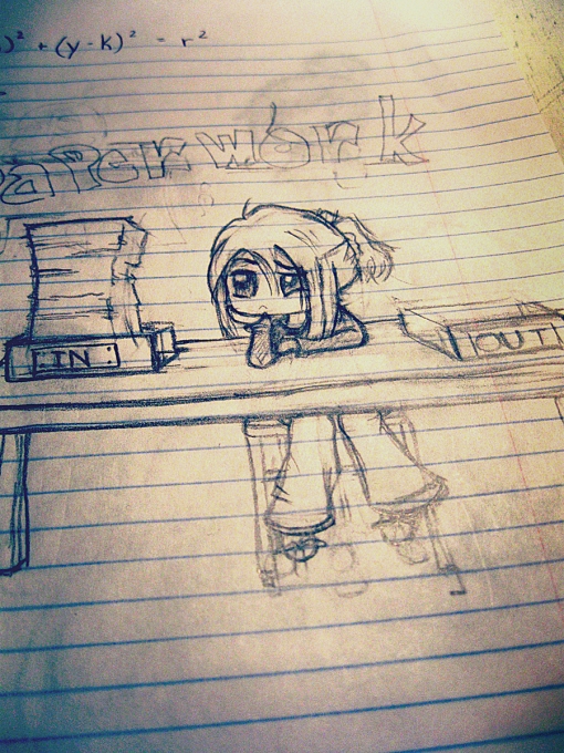
(I had been working on graphing circles with a student earlier in the morning…)

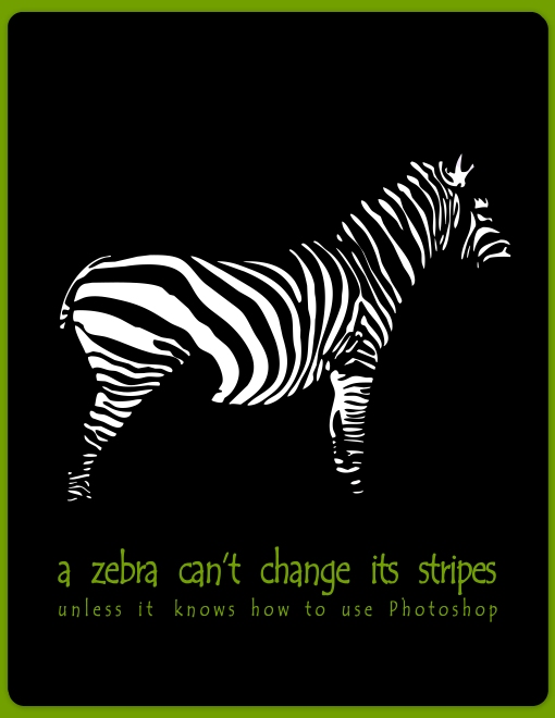
The finished Photoshop-altered illustration:

the Joy of Paper work by Karissa Cole 2014

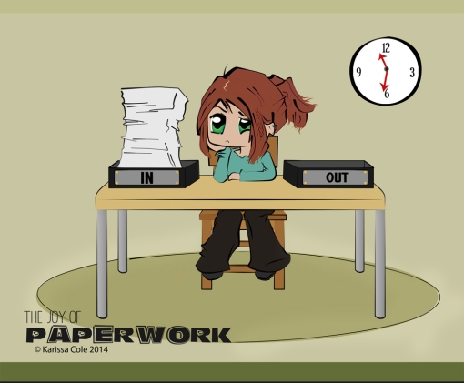
It’s a fairly simple thing. I’m still not settled on the colors I chose, so I might end up changing that at some point (along with the way-too-small hand I only just noticed…) Nevermind that. Today (3/1) I decided to fuss with the original a bit. Version two:

the Joy of Paper work by Karissa Cole 2014 v2

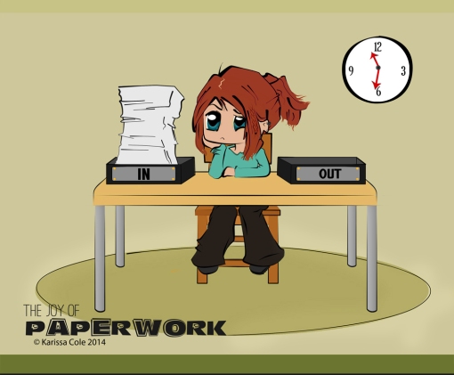
Still subject to change I suppose. But all in all it’s not too bad. I used to draw all the time. I wish it came that easy to me now. It’s been a few years since I’ve really done any drawing. Those were good days, less complicated. I miss them, and remember them well. Anyway, this is the first thing I’ve really drawn since my Super Lazy picture. Despite being a bit rusty I’m a might pleased with the way this came out. It feels good to at least try to draw again.

Related Posts:

Baby Dinosaur by Karissa Cole 2012 - all rights reservedSuper Lazy 5 by Karissa Cole 2013 all rights reservedBaby Yeti - Karissa Cole 2013 - All rights reserved

the Sad Cephalopod – pattern now available!

It might take me a while, but I get things done! I introduced my Sad Cephalopod amigurumi back in June, and now the crochet pattern is available in my etsy shop :)

To welcome this pattern, let me introduce to you Maestro, the newest squid to join the ranks:

Squid!

He’s the result of the final pattern test, to make sure the directions were all clear and accurate. Only took me about an hour to make. And I have to admit, I am completely in love with this color. It’s Loops & Threads Impeccable Brights: Sunny Day. I had to restrain myself from buying the entire stock last time I was at Michaels.

Anyway, I’m completely and totally new to this whole selling concept, so bear with me. It’ll take me a little while to get the hang of online shops and whatnot. But I’ll figure it out. (Thanks in advance for sticking with me :D). If you have any questions or comments please let me know!

Now, although I’ve finally got an Etsy shop, I want to make sure it’s clear that I will still be offering free patterns right here on this blog. Making some extra money by selling patterns is cool with me, but I still hope to make the majority of my patterns free for all you totally awesome ami makers out there :)

The Cephalopod is actually pretty simple to make, and the pattern has all the information you need to guide you through to making your very own lovable squid :)

the Sad Cephalopod amigurumi pattern etsy listing

Now, go snag your own copy and get to squid-making!

Except Dead Ends

Originally I was going for inspirational quotes. But I now know I am incapable of not being sarcastic in some way.

 "Worrying is a misuse of imagination." Try thinking about how awesome it would be to have a pet dragon instead.


“Worrying is a misuse of imagination.” Try thinking about how awesome it would be to have a pet dragon instead.

"A good deed can brighten a dark world." If that fails, try a flashlight.

“A good deed can brighten a dark world.” If that fails, try a flashlight.

"If you don't know where you're going any road will get you there." Except streets marked "Dead End". They usually don't lead anywhere.

“If you don’t know where you’re going any road will get you there.” Except streets marked “Dead End”. They usually don’t lead anywhere.

I think I will file this under the “satire” category in my portfolio.


Walking through Space

WalkingThruSpace by Karissa Cole

Recently I was asked to create a tutorial regarding some of the celestial things I make. This is not it. Actually, this is, for lack of a better word, practice.

I’ve never actually made a full celestial-related tutorial before. I’ve done a few walkthroughs but no step-by-steps. This is probably partially because when I’m working in Photoshop I completely lose all track of everything – time, layers, processes – and just go with the flow, see what happens. That and I’ve never considered my work worth repeating. But there are a few beginners out there who, for now anyway, disagree and would like to know how I do what I do. So I thought it might be fun to rise to the challenge of creating something neatish and writing down the steps used so someone else could follow along.

The piece above is my very rough draft. A testing ground, if you will, for techniques and design aspects. I didn’t include all of the exact steps, but rather the general methods used. The final tutorial I create will most likely deal with a more complicated image in depth; this blue one is really very simple and didn’t involve all that much. But it served me well here, where I could use it to help myself figure out how I might want to lay out the future tutorial. I’ve taken my notes and learned what I need to improve upon for the final guide. Now I just have to, you know, make it.

I may end up back-burnering the tutorial for just a bit though, as, in other news, I’ve been in an amigurumi-making mood for a week or so and I’m just on a roll. Four new patterns are already either in the works or completely done.

I’ve also got another relatively big project in the works. Nothing too phenomenal, but there will definitely be some new stuff – ami patterns, short stories, illustrations, and new photo shoots – showing up soon. Somewhere in all of this the tutorial will be published, of course. Keep an eye out!

2012

I’m typically not one to get hyped up about the dawn of a new year. I don’t give much contemplation to the year beginning and I don’t do much reminiscing about the one ending. Every day’s just another day to me. Before you think jeepers what a dull outlook, let me expound upon my viewpoint: The way I see it, each day -whether it’s at the beginning of the year, the end, or somewhere in the middle- brings with it the possibility for change, for excellence and for new things. I don’t need a specific date to show up on my calendar for these things.

But for once something’s got me thinking about this past year, and everything that’s happened. For some reason I sort of want to send this year off right. I think because 2012 was full of so much more than I think I had expected: craziness and creativity, innovations and irritations, new patterns and old ideas, silly stories and celestial exploration; colorful photos and cute cats, random designs and ridiculous posters; deadlines, new jobs and old jobs,calculations, learning and teaching, trying and thinking, figuring, slacking, sneaking, illustrating, living and loving, laughing and growing.

Needless to say not everything this year had been great, but I think I’ll manage to come out of it with plenty of good things. In honor of all those good things, or at least the art and design related good things, I made up a 2012 project collage (click to view larger):

a look at 2012 on the ea1701 blog 6

Here’s to 2012; you really weren’t the greatest of years, but we sure had some good times together. Thanks go out to all those who shared the year with me, too; You’ve made the bad times tolerable and the good times even better.

Get ready for more craziness, creativity, and who knows what else to come in 2013. Because I’m just getting started.

___________________________________

Make sure you haven’t missed any of the good stuff! Check out some of the biggest projects of the year:

Fall in love with free amigurumi patterns such as Melvin the Misunderstood Monster; Purploids, Pinkloids and Bloops (Oh My!); and Counting Sheep

Get splashes of color in the indoor/outdoor photo shoots like Of Course, Naturally; Water Colors; and Sun Stretched Arms

Boldly go where no one has gone before without having to leave your seat: explore space in these celestial artworks.

Paint your world with the help of the very first tutorial posted to the ea1701 art and design blog.

Slow and Steady

Slow and Steady (2)  by Karissa Cole 2012 all rights reserved

Made in Heaven (2)  by Karissa Cole 2012 all rights reserved

Fight fire (4) by Karissa Cole 2012 all rights reserved

Change Zebra (2) by Karissa Cole 2012 all rights reserved

Silence is golden by Karissa Cole 2012 all rights reserved

I don’t remember what was said, but something reminded me of that adage “slow and steady wins the race” a while back. My brain instantly turned it around and came up with that poster above. A few clicks in Photoshop later and I took a few other well-known adages and just did my thing. I thought some of them were kind of funny :D

It’s very simple. . .

I’ve never been much into now. I pretty much stopped paying attention to the world after 1994 when it comes to trends, social standards, and culturally accepted norms.

So put simply, I’m not a big fan of most modern anything, either ignoring it or readily ridiculing any inherit stupidity. I’m a bit like an old grumpy 78-year-old spinster hiding in a 22-year-old’s body, completely stuck in her ways. Occasionally, however, I stumble across some product of the 21st century that doesn’t make me weep and mourn the loss of all good entertainment. Usually, of course, whatever it is falls into either the science fiction T.V. show or soundtrack categories.

I have recently made a “discovery,” though. I suppose it’s hardly new for most people since it’s a T.V. show that’s been on for years.  I vaguely remember hearing about this show before, like most new things I ignored it. But my curiosity was irreversibly peaked when I saw a clip of it a couple weeks ago, so I watched a bit of it and fell in love. Granted, I’m not a big fan of the episodes flaunting characters displaying the common but altogether inglorious low moral standards (I’m very “Dick Van Dyke Show”). But there are some really great episodes. And more often than not I find myself  laughing like crazy, especially when a geeky reference is made that I completely get. I refer of course, to The Big Bang Theory. I won’t go on too much about how hysterical it can be and how awesome the scifi references are for a geek-girl like me. I completely realize how very behind in the times I am regarding this.

The whole point of this post is actually just to say that even something as simple as a sitcom can lead to a nice exercise in graphic design.

From the get-go Sheldon has by far been my absolute favorite character. So, naturally, I decided to make this 11 x 17 poster inspired by and sort of in honor of Dr. Cooper. It was a nice way to work some fun stuff into my graphic design portfolio.

Rock Paper Scissors Lizard Spock playing guide by Karissa Cole 2012

I shall never play rock-paper-scissors the same again.

Bazinga.

new Look, new Name, new Logo

So as it turns out, yesterday, I apparently renamed my blog. exastris1701 is now ea1701. I’m still not too sure how that happened. I remember messing around with the theme, color scheme, and page headers. . .  after that it gets a bit fuzzy. As far as I know I didn’t mean to change the name. But it’s done now and it looks like there’s no turning back.

The site’s getting a makeover this week: links are being updated, pages are being polished. There’s a new color scheme in play and several  new banners, displayed at random, now adorn each page. In honor of all this “new” I’ve decided to create a logo.

Here’s my first prototype:

ea1701 logo prototype

Clearly my logo design skills (if you can call this skill) still need to be honed. That’s the one thing I never really learned in school. That and typography. But I think I’ve already devoted part of a post to the nightmarish typo class I took last year. No need to rehash.

I think I may stuff Browsing the Internet for Interesting Logo Design Ideas – something I without a doubt need – somewhere onto my brimming with creative things (as usual) To-Do List. It’s not exactly a hot need or anything, but I still think it could stand to head the list. This logo thing can sit not too far behind my almost finished short story/amigurumi design combo and animal themed cupcakes.

Heehee.

Left vs. Right

In my post yesterday I mentioned my lack of right brain usage lately. I’ve been very left brained – math, logical thinking and puzzle-solving have been really the only things on my list of recreational activities. (My walls – covered in part with chalkboard paint – have been recently adorned with mathematical equations, and a list of the values of i with various exponents.)

I realize there’s been speculation regarding whether or not the left hemisphere of the human brain does indeed control logical, orderly thought and the like, whereas the right side pertains to creativity and emotions, but even so, I found myself somewhat inspired to create a poster regarding the notion:

Left vs Right by Karissa Cole - All rights reserved

I admit, as this falls very near the “typography” category, it’s not a necessarily superb piece. I greatly admire typographical work and they are often among my favorite design pieces. But I know little about the art, or at least, I don’t have enough skill to create the great pieces I so revere.

I did once take a typography class in school. But the only thing I ended up learning was how to restrain myself from leaping from my chair and strangling the instructor across the desk. He was the biggest idiot masquerading as a teacher I have ever known. Not only did he not know how to use Adobe Illustrator (I made the mistake of asking him how to create a certain look and ended up – no lie – teaching HIM how to use some of the tools and functions), he never once focused on typography, and instead had us create brochures and pamphlets. Uh, thanks dude, but we make that stuff in our GRAPHIC DESIGN CLASS. And I realize the two go hand in hand, but come on. What kind of typography class doesn’t focus on words? Plus, his own stuff, which he made us look at at the beginning of each class, were some really lousy designs.

But I digress.

Left vs. Right. And the battle continues. . .

the Original Accordion Hero

When I was a kid, Weird Al Yankovic was my all-time favorite artist. I remember I had a few of his cassettes – “The Food Album” and “Dare to be Stupid” – and I’d put a tape in my little Walkman, put on my headphones, and every night I’d fall asleep to songs like “I Love Rocky Road,” “I Want a New Duck,” and “Taco Grande.” I loved them all.

Come to think of it, Weird Al was pretty much the only music I knew (besides stuff I got from my parents like CCR, the Steve Miller Band and Harry Chapin) but I was perfectly content with that.

Although Weird Al no longer encompasses my entire music collection, every now and then I still go through and listen to my entire list of songs all day; which, yes indeed, is what I’ve been doing today. And strangely, although not having done much digital work, I kind of felt inspired:

the Original Accordion Hero (Pop Art by Karissa Cole)

I don’t know what made me think of it, but listening to “White and Nerdy,” “Perform This Way,” “Yoda,” – more of my favorites – the idea just popped into my head. I found this photo by Dwight McCann and used it as a reference for my vectorish pop art fandom piece here.

In a sort of ironic kind of way, after making this I found my old Greatest Hits Vol. II CD. These days all my music is digital – I haven’t really used a CD in years. I had completely and totally forgotten that the cover of that album was done in a pop art style, so I was seriously dumbfounded when I stumbled across it and realized the artwork I made today reflected the CD cover I hadn’t seen in about 15 years.

So I just had to play around with more vector art after I saw it. Only this time I mimicked the album art on purpose.

Weird Al Popart Poster by Karissa Cole 2012

Although I’ll have to think of a better caption for this one, I think, I have to say, occupying myself with my vector tools and a blinding array of contrasting colors was sooo much fun. And I’m sure I’ll stop seeing spots any minute now.

justcreateandscrap.wordpress.com/

Love, imagine, create, scrap, live.

Jee's Studio

Passionnée de scrapbooking, retrouvez ici mes créations ;)

Doodle Addicted

All drawings © Heidi Denney unless otherwise noted

Watercolor Journal

... a place for people with a passion for art

The Poetic Monster

Just a Few Words From a Shy Beast

L&K's Creative Threads

Distinctive Children's Clothing and More

BitterSweet

Sweet Musings with a Bitterly Sharp Wit

[ One Velvet Morning ]

Project Life Freebies, Printables & Digital Scrapbooking Templates

Awesome Wallpapers

Hand-Picked, High-Quality Widescreen Walls

ea1701

art and design (and other stuff, too)

Karissa Cole Design Portfolio

I have a brain and I'm not afraid to use it

Awkward Soul Designs

Knitting, Crochet & Amigurumi Patterns