What you need:
• the free fractal program Apophysis 7x
• photo editing software, such as Adobe Photoshop
• and basic knowledge of how to use both
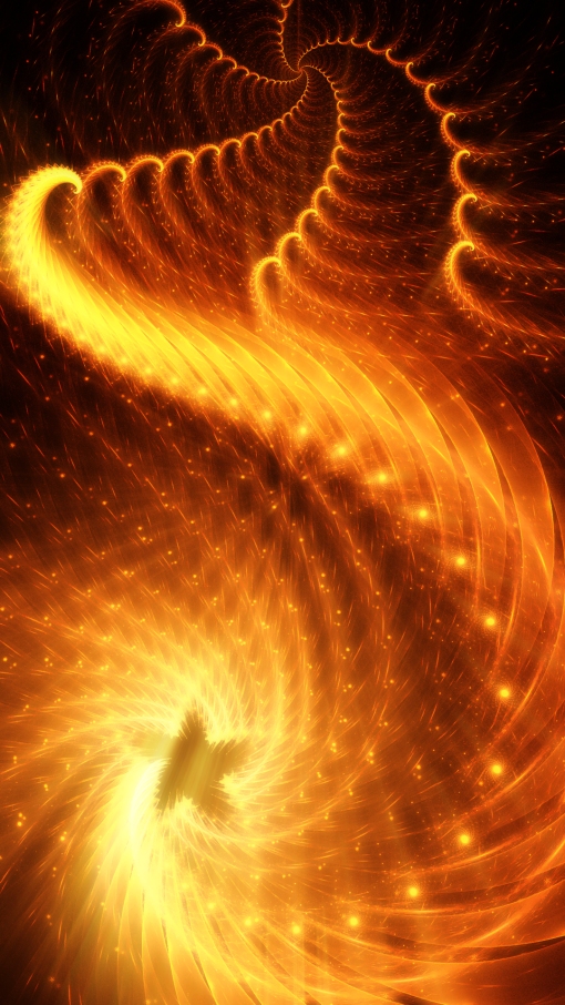
What we’ll be making:

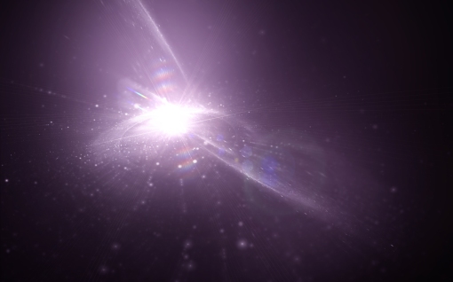
Personally, I think a good tutorial should both clearly explain how the specific piece was made (so you don’t go nuts stuck with generalities, trying to figure out how they got that one detail just right), and provide several variations to try (so you’re not stuck with an exact replica of someone else’s work.) This is what I’ve tried to do here. If you follow the following steps closely, your result should look very similar to the image above. But I’ve also listed some variations you can try, so you can completely customize your final fractal.
Some things to note before you begin:
• This tutorial assumes you’ve already got working knowledge of Apophysis – how to create a flame and new transforms, where to enter in variations and variables, and how to make overall image adjustments. If you’re completely new to the program check out the Apophysis F.A.Q and be sure to also check out this icon-identifying tutorial as well.
• If you use this tutorial – especially if you follow the steps to the letter – please respect my artistic rights and link people back to this blog. This is a courtesy to others who may wish to learn how to use this technique and to me (after all, I spent all this time creating this tutorial – and if you like it enough to use and show off, then I deserve a bit of credit.)
• This whole process is fairly quick – less than an hour from start to finish. But as with all digital art endeavors, it might be a good idea to save your progress frequently to avoid losing anything you make.
• If you are not specifically instructed to change the value of a certain variation, leave it at its default setting. For example, the default variations for a transform are: linear3D: 1; everything else: 0. If you are asked to change julian to 2 but nothing else is mentioned, only change julian, and leave linear3D at its default value of 1. This applies to weight values (default: 0.5), too.
• Screen shots follow each step. Click any screen shot to see it larger.
When ready to begin, start off by opening up Apophyis 7x (or whichever version you have – it just must be 3D capable) and create a new blank flame.
Impatient folk – like me – who just need to know the bare essentials of this flame should take a look at the following (however, those who want the step-by-step with pictures can just treat this as a summation of what we’ll be doing):
xform 1)
• Weight: 0.05
• noise = 0.15 (try experimenting with values between 0.1 and 1.0)
• blur = 0.25 (try experimenting with values between 0.1 and 2.0)
xform 2)
• Weight: 0.95
• linear3D = 0.2
• spherical = 0.75 (try experimenting with values between 0.45 and 0.95)
xform 3)
• scale down twice; move and flip
xform 4)
• scale down twice; move and flip
xform 5)
• linear3D = 0
xform 6)
• linear3D = 0
• julian = 2; julian_power = 2
Depth blur: 0.2
Pitch: 60
Yaw: 10
Perspective: 0.7
Scale: 110
Gamma: 2
Brightness: 12
Step-by-step:
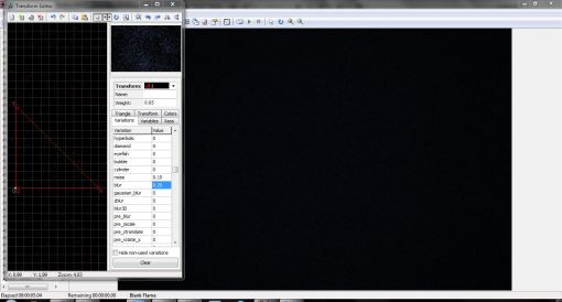
Open up the Transform Editor and make the following adjustments to Transform 1:
Weight: 0.05
noise = 0.15 (try experimenting with values between 0.1 and 1.0)
blur = 0.25 (try experimenting with values between 0.1 and 2.0)
Not much should be happening so far, so don’t worry if all you get is a bunch of “static”.
Add the following transforms with the specified features:
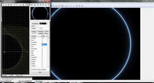
Transform 2
Weight: 0.95
linear3D = 0.2
spherical = 0.75 (try experimenting with values between 0.45 and 0.95)
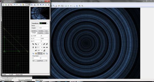
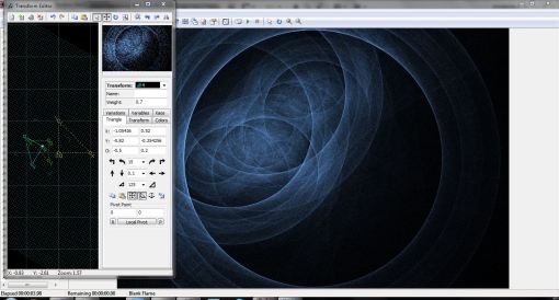
Transform 3
• Scale down twice by the default factor of 125 (try experimenting with scaling down (or up!) by a different factor)
• Move the transform to the left and and rotate (see photo for reference but experiment with placement and position)
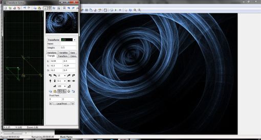
Transform 4
Weight 0.70
• Similar to transform 3, scale down twice by the default factor of 125.
• Move the transform to the left and and rotate. Note that this transform does not need to be placed in exactly the same spot as transform 3. See photo below for reference, but experiment with placement and position.
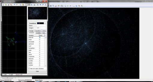
Transform 5
linear3D = 0 (all variations should now be set to ‘0’)
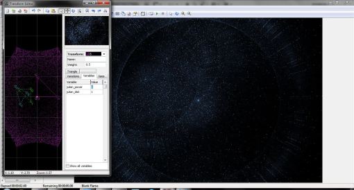
Transform 6
linear3D = 0
julian = 2 ; julian_power (Variables tab) = 2
We’ve created all the necessary transforms. Now we’ll open up the adjustment window, and watch our fractal really take shape. Experiment with the pitch, height, yaw, and depth blur values. I used the following:
Depth blur: 0.2
Pitch: 60
Yaw: 10
Perspective: 0.7
Scale: 110
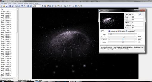
(A note on scaling: for this piece I increased the scale but drastically decreased the zoom, thus allowing for about only 10 minutes of rendering time. Increasing the scale and zooming out this much does decrease quality somewhat, but as I had processing with Photoshop in mind for the final product, it didn’t matter. Adjust your fractal’s scale and zoom as you see fit.)
Switch to the Rendering tab of the adjustment window and change:
Gamma: 2
Brightness: 12
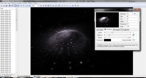
Adjust the camera settings (rotate, X axis, Y axis) as you see fit. As I mentioned earlier, I zoomed all the way out. I also shifted the fractal up and to the right a little.
Now choose a gradient you like. I used a default. The gradient you choose will dramatically alter the way your fractal looks, so play around with it a bit. To spice things up a bit, hit the key combination ctrl+alt+n to randomize the color values.
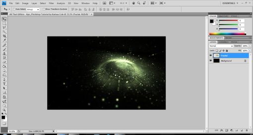
When you’re happy, render your fractal! We’ll then open it up in our editing program to add some glitz (a word I never thought I’d use. Ever).
Open up your fractal in Photoshop. Set it to screen against a black background. (Ignore the fact that the screen shot says the blending mode is “Normal”. Heh heh. . .)
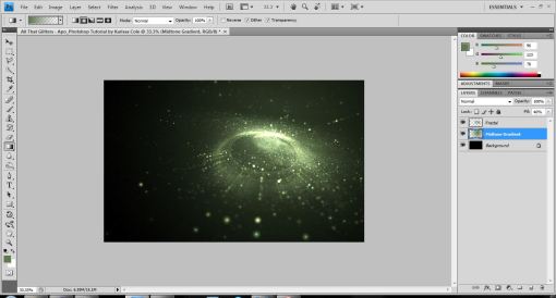
Create a new layer (ctrl+shift+n) [blend mode: normal] between your background and your fractal. With your circular gradient tool (shift+g x2) active, select a midtone color from your fractal (by alt+clicking). On this new layer create a gradient emanating from the center of your fractal. Lower the opacity of this layer, if need be.
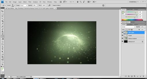
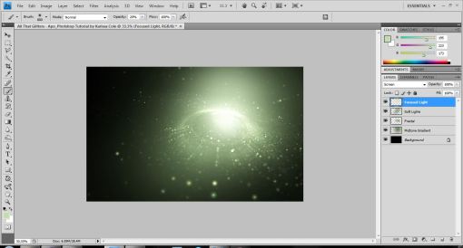
Create a new layer (ctrl+shift+n) [blend mode: screen] above your fractal. With the same midtone color and a large, soft, round brush (low opacity) selected, paint lightly near the center of your fractal.
We’re creating our base light source here, so think about which bit of your image you want to be lit the most, the least, and somewhere in between.
Create another new layer (ctrl+shift+n) [blend mode: screen] and repeat this process, only this time narrow down the beam of light you paint.
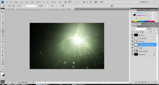
To add a lens flare create a new layer (ctrl+shift+n) [blend mode: linear dodge] fill it with neutral (black), and set the lens flare at the epicenter of your light source.

For more lighting effects, duplicate your fractal layer [blend mode should still be screen], rotate it 180 degrees, stretch it and position it so it looks like a light trail from something crashing into the center of your fractal.
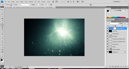
Continue duplicating your original fractal layer, warping it and positioning it in your image. Play around with the opacities of each duplicated fractal. (Be sure to erase any hard edges you may have during this part.) Optional: Create a color balance adjustment layer to fine tune your colors.
To add some neat finishing touches create a copy of all the visible layers (crtl+shift+alt+e). Duplicate this layer. To create a “glass-like” look apply the Smart Blur filter (default settings) to this layer. Lower the layer’s opacity a bit.
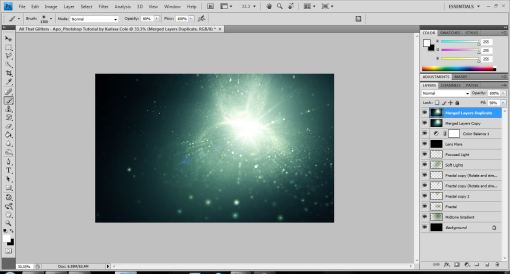
Fuss around with the colors and sharpness of the image until you’re satisfied. Then save your image. Done!
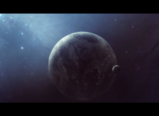
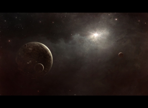
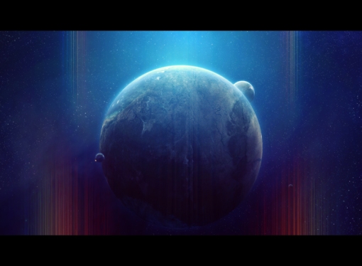
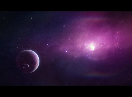
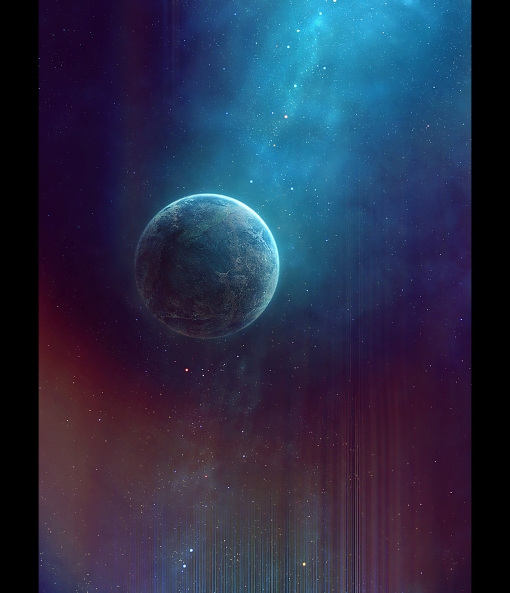
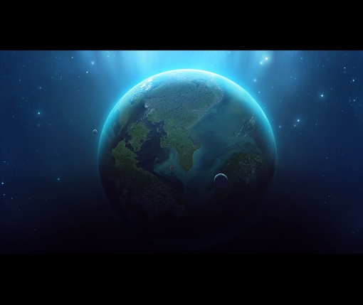
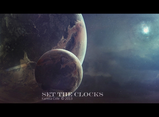
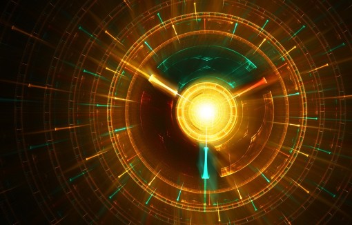
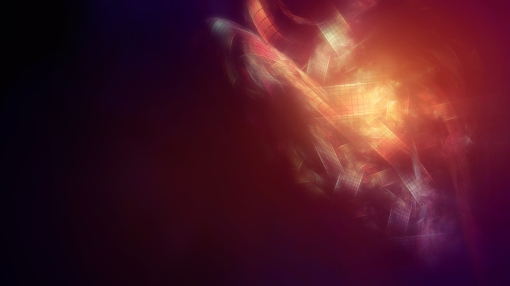
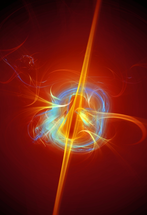
Each of the following images were made using the techniques above:


I only just stumbled across this method yesterday, so I don’t doubt that there are limitless variations one could come up with using these steps as a base. I highly encourage anyone to experiment and have fun!


")
")
")
")


 by Karissa Cole 2012")

 by Karissa Cole - all rights reserved")


")


")
 by Karissa Cole")
 by Karissa Cole 2012 all rights reserved")

 the Rainy Day by Karissa Cole 2013")


 by Karissa Cole")


 the Rainy Day by Karissa Cole 2013")


 by Karissa Cole")

 by Karissa Cole 2013 all rights reserved")


 by Karissa Cole")


")
 by Karissa Cole sdvw")


")


