It’s very simple. . .
I’ve never been much into now. I pretty much stopped paying attention to the world after 1994 when it comes to trends, social standards, and culturally accepted norms.
So put simply, I’m not a big fan of most modern anything, either ignoring it or readily ridiculing any inherit stupidity. I’m a bit like an old grumpy 78-year-old spinster hiding in a 22-year-old’s body, completely stuck in her ways. Occasionally, however, I stumble across some product of the 21st century that doesn’t make me weep and mourn the loss of all good entertainment. Usually, of course, whatever it is falls into either the science fiction T.V. show or soundtrack categories.
I have recently made a “discovery,” though. I suppose it’s hardly new for most people since it’s a T.V. show that’s been on for years. I vaguely remember hearing about this show before, like most new things I ignored it. But my curiosity was irreversibly peaked when I saw a clip of it a couple weeks ago, so I watched a bit of it and fell in love. Granted, I’m not a big fan of the episodes flaunting characters displaying the common but altogether inglorious low moral standards (I’m very “Dick Van Dyke Show”). But there are some really great episodes. And more often than not I find myself laughing like crazy, especially when a geeky reference is made that I completely get. I refer of course, to The Big Bang Theory. I won’t go on too much about how hysterical it can be and how awesome the scifi references are for a geek-girl like me. I completely realize how very behind in the times I am regarding this.
The whole point of this post is actually just to say that even something as simple as a sitcom can lead to a nice exercise in graphic design.
From the get-go Sheldon has by far been my absolute favorite character. So, naturally, I decided to make this 11 x 17 poster inspired by and sort of in honor of Dr. Cooper. It was a nice way to work some fun stuff into my graphic design portfolio.

I shall never play rock-paper-scissors the same again.
Bazinga.

")
")
")
")


 by Karissa Cole 2012")

 by Karissa Cole - all rights reserved")


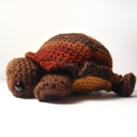


 by Karissa Cole")
")


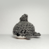
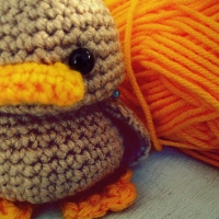
 by Karissa Cole")

 by Karissa Cole sdvw")


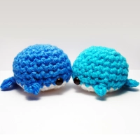
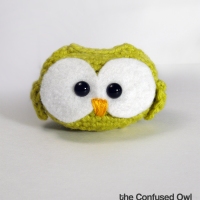
 by Karissa Cole")
 by Karissa Cole 2012 all rights reserved")


 the Rainy Day by Karissa Cole 2013")


")


")


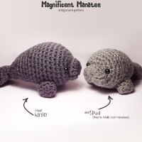
 by Karissa Cole")


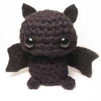
 by Karissa Cole 2013 all rights reserved")

")

 the Rainy Day by Karissa Cole 2013")
